SALTY MUSIC FESTIVAL
Poster Series
PROJECT DESCRIPTION
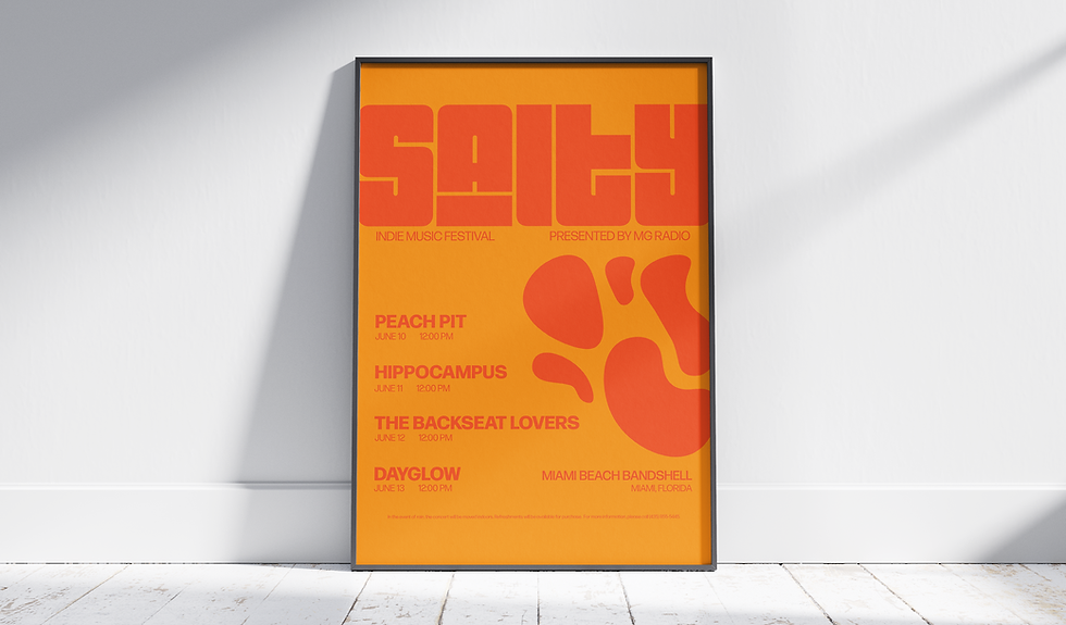
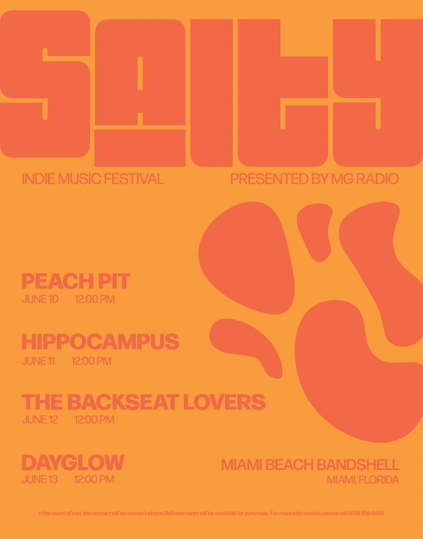
This project involved designing a series of posters for "Salty," an indie music festival. My aim was to create eye-catching designs that would effectively promote the festival and capture the indie music vibe. I chose a bold approach, utilizing bright, vibrant colors and large, impactful typography to immediately grab the viewer's attention.
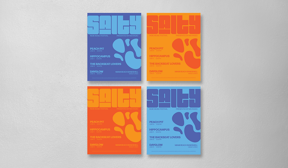
To add variety and visual interest to the campaign, I developed four different color variations for the poster series. One combination I particularly focused on was orange and blue, as these complementary colors create a striking contrast and enhance the overall boldness of the design. The color variations allow for flexibility in placement and distribution, ensuring the posters stand out in different environments.
The illustrations used in the posters are intentionally simple and abstract. This allows the large, prominent typography to remain the primary focus, ensuring the festival name and key information are easily readable.
ANIMATION
To further enhance the impact of the "Salty" poster series, I created a dynamic animation that brings all four color variations together. This animation sequences through each of the four color palettes, showcasing the full range of designs in a visually engaging way. Each color scheme is displayed for a long enough time, allowing viewers to read all of the information presented on the poster. The smooth transitions between the different color combinations create a sense of movement and energy, mirroring the vibrant atmosphere of the music festival itself. This animated format is ideal for digital platforms and social media, where it can capture attention and effectively communicate the festival's branding and key details.